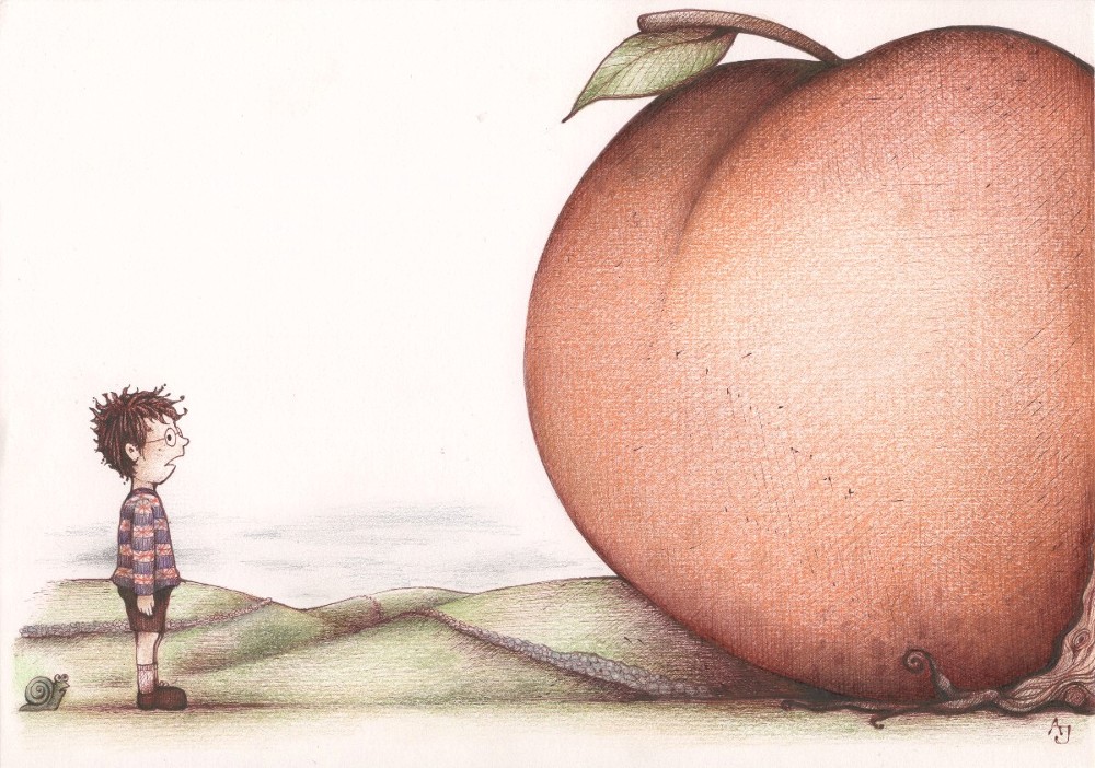
‘Something is about to happen,’ he told himself. Something peculiar is about to happen at any moment.’
James and the Giant Peach illustrated by Andrea Joseph
James and the Giant Peach illustrated by Andrea Joseph
|
‘Something is about to happen,’ he told himself. Something peculiar is about to happen at any moment.’
James and the Giant Peach illustrated by Andrea Joseph 
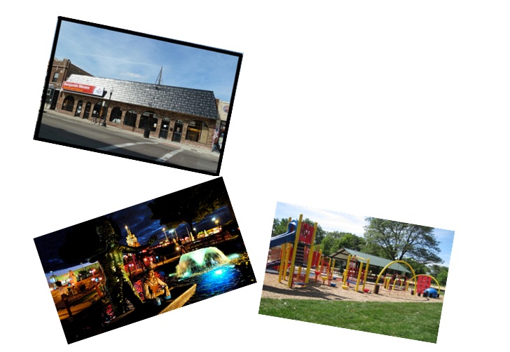
Triathletes biking on Lake Shore Drive
(don't worry I pulled over to take the picture)
I take Lake Shore Drive to get to work at the paint store. Today I got to share the drive with the triathletes! Aren't they awesome!
Most of us love natural light and go out of our way to bring as much as possible into our homes. The way it
filters into our homes can affect the way color looks in our space. Often, when helping clients choose colors for their space I take into account the location of the windows, they'll reveal how much sunlight will come into that room. So, be prepared and chose colors depending on your delight of sunshine. Here’s a guide. North – most consistent light & coldest exposure (brrr!)direct sunlight only occurs in the middle of summer. In this space use warm colors such as red, yellow or orange to compensate for the coolness of the light. Blues or greens will make the room appear even colder. South – good warm light (aah!) You can use darker colors in a room with a southern exposure. Blues and greens in this room can create a summery feel all year long. East – warm bright light, especially in the morning (now, where're my sunglasses?) but muted middays. The afternoon offers no direct light, so you'll want to use a mix of warms and cools to balance out the daylight. West – hottest light of the day (take out that sun block and consider getting a window treatment that diffuses light to protect your furniture and artwork from fading away.) features afternoon and evening sun. Use neutrals in this room. Using warm colors will overpower the room in the afternoon. There you go, pretty simple. Although, I don't think any amount of natural light or lack there of will make mustard yellow look good! What's your favorite type of natural light? 
We went to PAWS Chicago today to look for a dog to adopt. Gabriel and I narrowed it down to 3. 
That's Owen, Lucy and Ralph.
We're going back next week to see which one of these little guys picks us as his new family. 
More work at the paint store this weekend. It looks like it's turning into a regualr thing. That's ok though, it'll help speed up the plans I have for 2013.
See that first picture up there? That's a very blurry picture of Mancow Muller. I was a total nerd and freaked out a little but we had a nice conversation when I was done being weird. It's the closest I've been to a "celebrity" since Rick Springfield gave me a kiss at a concert about 7 years ago; that's a story for another time. Gabriel and I went to see ParaNorman. I thought it was cute movie, Gabriel, on the other hand was not impressed. We totally missed the Air and Water Show, oh well. "Don't make me throw this hummus! It's spicy!" I keep saying that to Gabriel. It was the funniest line from the movie. I think I'm beginning to annoy him. Have you got any funny lines?  I've been working a bedroom redo for one client.  And getting bids together for another clients new garage
 We had a pretty low key weekend.
1. I worked at the paint store Saturday and Sunday. 2. But, Gabriel and I managed to get in a little miniature golf time at Haunted Trails on Saturday night. My kiddo likes mini golf, but what he loves even more is driving the race cars! 3. After work on Sunday we walked to the park to play on the monkey bars for a while. Good time had by all. How was your weekend?  All whites have different undertones which can be hard to distinguish. If you're trying to decide between different off-whites, putting them on a plain sheet of white paper will make those undertones pop and easier to see.
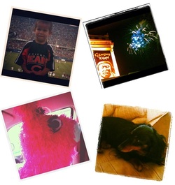 1. Fun at the Bears Family Fun Fest. Bear Down! 2. Fireworks! 3. We gave this little pink donkey pinata a ride to my niece's birthday party! 4. We get to take care of this little doxie girl for the week! Do you have those times in your life where you feel like things are shifting? I've been having this feeling for about a month now, so I'm patiently waiting to see how things shake out. I'm on the verge of new beginnings, focusing on new projects for my kiddo, myself, my studio and taking some new directions...  |